
Exploring NEA's Our Town with Codex

I’ve been using LLMs as coding aids for some time, and they have definitely enhanced my abilities, both through speeding up things I could have otherwise done, and also allowing me to try out analyses that I could envision but would not have known how to execute. I recently gave Codex 5.3 a whirl, and it is obviously a huge advance. To try it out, I worked with it to analyze a dataset of project reports for the National Endowment for the Arts’ Our Town program. This is a dataset I had lying around and probably would have left sitting there, so I figured it would be a nice way to explore something that would go otherwise untouched.
I’ll summarize and contextualize what I found below. To preview, probably the most interesting results show project descriptions shifting in their language away from economic development over time. Perhaps more interesting is the impact analysis, which merges the Project Data with zip code business pattern data, to look at if the development trajectory of areas that received Our Town grants changes after receiving the grant.
To do that, I compared the recipient zip codes to otherwise similar zip codes, in terms of some basic demographics, as well as their trends in total businesses, arts & entertainment businesses, restaurants, and hospitality businesses. This matching is important, since the zip codes that received the grant were usually already on the rise in terms of total businesses, arts organizations, restaurants, the the like. So it is possible that the grant did not do anything but put a stamp on what was already happening anyway. Comparing to other places already on similar trends asks if the treated zip codes (the ones that got a grant) diverge from the trend they were on relative to the similar ones.
Overall, it turns out that Our Town grants do seem to have had a pretty sizeable impact, especially the ones from the first year of the program. The biggest impact was on the hospitality sector and restaurants, though there also was substantial growth in community organizations, arts organizations, and total businesses. This is all over and above the growth they were already experiencing. Moreover, the impact is stronger where the grant was more intensive, in the sense of activating more venues. The grants also seem to have had significant spillover effects, impacting not only the target zip code but organizational growth nearby. So the bottom line is that Our Town grants do seem to have sparked significant social, cultural, and economic development in the neighbourhood that received them.
But before I do show the results, a reflection about my subjective experience of this process and how it relates to the academic publishing process. The main experience I have felt in this domain is one of having my capacities expanded. In this case, this saved me from doing a bunch of data cleaning and preparation, reshaping the file in various ways, hours poking around stack exchange, merging files, and the like. This is all very tedious and I’m glad to not do it.
The main analyses I did I also probably could have figured out how to do, but they would have inevitably raised little problems in terms of setting up the code and debugging it, which could have also taken a while. That’s also something I never really enjoyed. It is also the kind of thing you could find yourself obsessing about, tinkering around with for hours, before looking up to find that it is 4am. When you get it to work, there’s a brief sense of accomplishment, before realizing how much else you could have done with that time, just to get this damn code to work. So now I can do other stuff with that time.
All told, the below analyses took a few hours with only off and on attention from me. It is not a one-shot type of thing, I had to guide it here and there toward questions and approaches and methods I thought would be good. But even during the course of those hours Open AI pushed an update which performed better than the previous version, in that the agent could identify problems on the fly and try out solutions.
Probably if I had done this analysis 5 years ago it would have taken several months or more. If I had taken those several months, I would have felt a lot of internal pressure to publish the results in an academic journal. I would have almost certainly eventually accomplished that. But now, I feel very little internal drive to do that. That’s a kind of response I didn’t expect, and it seems it is based on some internal heuristic I have where amount of time and effort by me justifies time and effort to seek publication.
The result is that if I were to try to publish this research direction, I’d likely need to think of how to combine it with a lot of other data to be able to pose new or higher order questions. The other option is to post it somewhere, perhaps here at the Journal of AI Generated Papers, where others could access it and potentially use it together with other results to ask new and higher order questions. I suppose that would not be a bad outcome either way.
I won’t show all of the results, but highlight what strike me as the more interesting. Yes, Gemini provided a lot of the background information.
Background
The National Endowment for the Arts (NEA) launched the Our Town program in 2011. It serves as the agency’s primary mechanism for “creative placemaking,” a field of practice that integrates arts, culture, and design activities into efforts that strengthen communities by advancing local economic, physical, and social outcomes.
Origins and Theoretical Foundation
The program was created during the chairmanship of Rocco Landesman, who was appointed by President Obama in 2009. Landesman sought to position the arts as a vital sector for economic recovery and community development. To provide a theoretical framework for this approach, the NEA commissioned a white paper titled Creative Placemaking (2010), authored by Ann Markusen and Anne Gadwa Nicodemus. This document defined the concept and argued that strategic investments in the arts could rejuvenate shrinking cities, enhance public safety, and foster economic growth.
Following this research, the NEA established Our Town as a pilot program to fund these types of projects directly. The initiative was designed to demonstrate that arts funding could function as a core component of community revitalization rather than a peripheral amenity.
Program Structure and Requirements
A defining feature of Our Town is its specific eligibility requirement regarding partnerships. All applications must include a partnership between a nonprofit organization and a local government entity. This structure ensures that projects have both civil society support and official municipal endorsement, encouraging long-term sustainability and integration into broader city planning efforts.
The program typically offers matching grants ranging from $25,000 to $150,000. These funds support various activities, including arts engagement, cultural planning, design, and artist residencies. The NEA requires that these projects align with a community’s existing development strategies.
Critiques and Controversies
The Our Town program and the broader framework of “creative placemaking” have faced significant scrutiny from scholars, artists, and community activists. These critiques typically target the program’s initial heavy reliance on economic indicators and its relationship to urban redevelopment. The most persistent criticism is that creative placemaking serves as a catalyst for gentrification. Critics argue that by branding neighborhoods as “vibrant” arts districts, Our Town projects can inadvertently signal safety for speculative real estate investment.
Artists and cultural theorists have expressed concern that the program values art primarily for its utility in solving non-arts problems, such as zoning, tax revenue, or public safety, rather than for its intrinsic aesthetic or cultural worth. This “instrumentalization” risks incentivizing safe, decorative art that serves municipal goals while marginalizing provocative or critical work. Others have argued that many places designated as in need of “being made” have already been made by somebody already there, and their needs and priorities are often ignored by outsiders trying to “make a new place” there.
Institutional Responses and Evolution
The NEA has actively adapted the Our Town program in response to these theoretical and practical challenges. The agency has moved away from purely economic justifications toward a more holistic view of community health. The 2019 “Theory of Change” marked a departure from measuring success solely by immediate project outputs (e.g., number of festivals, new murals). The NEA now explicitly encourages projects that aim for “systems change,” asking applicants to demonstrate how their work will permanently alter local decision-making processes to be more inclusive and culturally responsive.
The NEA also updated its guidelines to prioritize projects that benefit underserved populations. The rhetoric of the program shifted from “attracting talent” to fostering “belonging” and “social cohesion.” The NEA undertook initiatives to provide grantees with coaching on equitable development strategies, helping to mitigate the risks of displacement. Finally, the agency has expanded its definition of “arts and culture” to include design, food, and traditional cultural practices, moving beyond a “fine arts” model that was often viewed as elitist.
The program remains active today, continuing to fund projects that situate the arts at the center of community development. It has awarded grants in all 50 states, Puerto Rico, and the District of Columbia, supporting diverse communities ranging from rural towns and tribal nations to major metropolitan centers.
I explored a dataset built from NEA Our Town FDRs (Final Descriptive Reports). An FDR is the standard report grantees submit to explain what their project was, what they did, who they partnered with, and what outcomes they saw. In this file, each row is one grant, with basic fields like fiscal year, grantee name, discipline, activity type, and award amount, plus six written-response fields (Narrative1–Narrative6). Those narrative fields contain the project story in plain terms: goals, activities, partners, policy context, and how success is defined. We have data for FY2011–FY2016.
Across the analyses, we ask four broad questions: (1) how the funding portfolio is structured, (2) what projects are saying in their own words, (3) where projects are happening and who they report serving, and (4) whether places that received projects show different development patterns over time. The first group of analyses covers grant size, activity/discipline mix, and whether awards are concentrated in a few organizations. The second group uses text analysis on the narrative fields to identify common themes (placemaking, partnerships, policy, success language) and how those themes shift over time. The third group looks at geography and demographic reporting from FOIA-linked files. The final group links project ZIP codes to external business and census data to compare pre/post trends, including matched comparisons to otherwise similar ZIP codes.
Portfolio Overview
Question
What does the overall portfolio look like in size, timing, and composition?
Method
We count projects by FY, discipline, and activity type, and summarize obligated grant amounts using NEA_OurTownData_Clean.csv (FY2011–FY2016).
Evidence
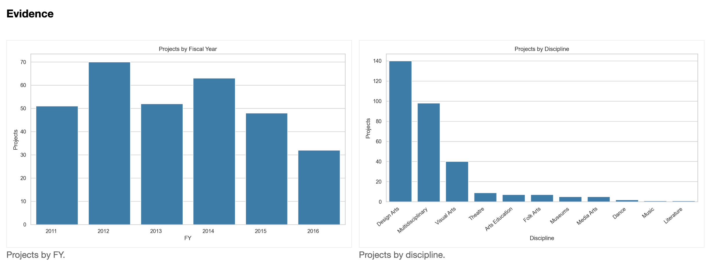
Answer
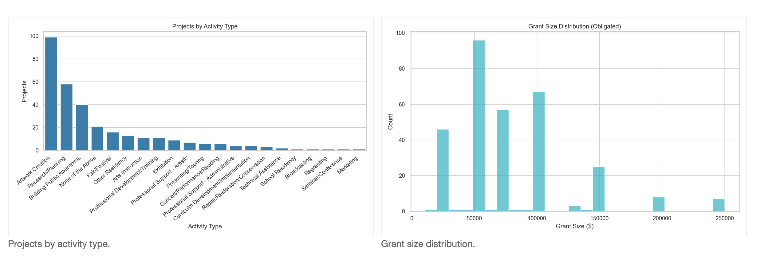
The portfolio includes 316 projects (FY2011–FY2016). Volume peaks in FY2012 (70 projects, 22.2%) and is lowest in FY2016 (32, 10.1%). Discipline mix is concentrated in Design Arts (140, 44.3%), Multidisciplinary (98, 31.0%), and Visual Arts (40, 12.7%). Activities are led by Artwork Creation (99, 31.3%), Research/Planning (58, 18.4%), and Building Public Awareness (40, 12.7%). Grant sizes range $10,435–$250,000 with mean $78,685.34 and median $75,000; 71.5% of awards fall between $50k and $150k.
Organizational Concentration
Question
Is the portfolio concentrated among a small set of grantees?
Method
We count awards per organization, compute concentration metrics (top shares, HHI), and plot the cumulative share curve.
Answer
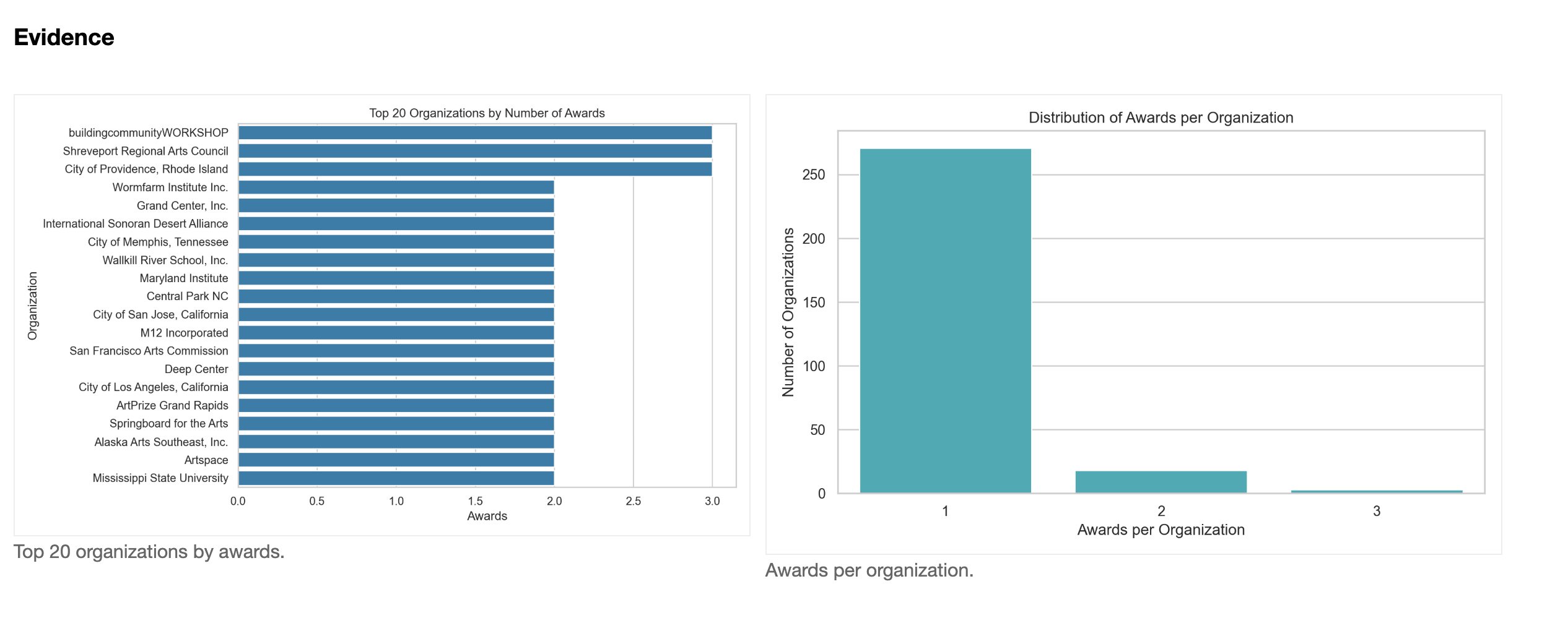
The portfolio is diffuse: 292 unique organizations for 316 awards. 271 organizations (about 92.8%) receive a single award, 18 receive two, and only 3 receive three. Top 5 organizations receive 4.1% of awards; top 10 receive 7.3%. Repeat‑award organizations account for 14.2% of awards, and HHI is 0.0037, consistent with low concentration.
FY Activity Composition
Question
How does the mix of activity types change over time?
Method
We tabulate FY-by-activity counts and shares, and visualize with heatmaps and stacked areas.
Answer
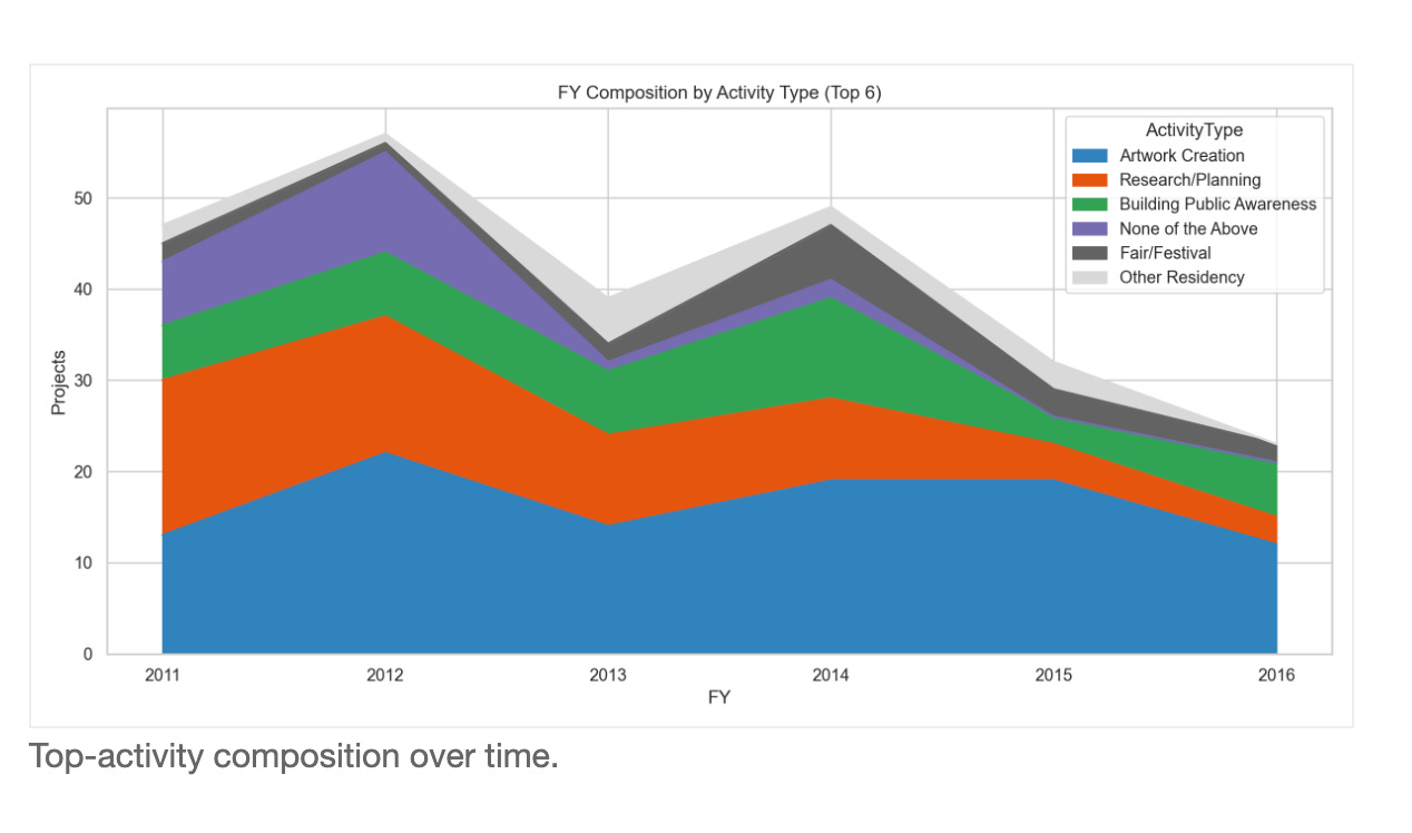
The mix shifts from planning to production. In FY2011, Research/Planning leads with 17 projects (33.3%). From FY2012 onward, Artwork Creation is the top category (e.g., FY2012: 22 projects, 31.4%; FY2015: 19, 39.6%). Research/Planning declines to 3 projects in FY2016 (9.4%), while Building Public Awareness peaks in FY2014 at 11 (17.7%). Overall, the portfolio shifts toward artwork‑creation activities over time.
Standards of Success
Question
How do projects describe success or measurement?
Method
We count outcome/measurement terms in Narrative 3 and compare by FY and activity type.
Evidence
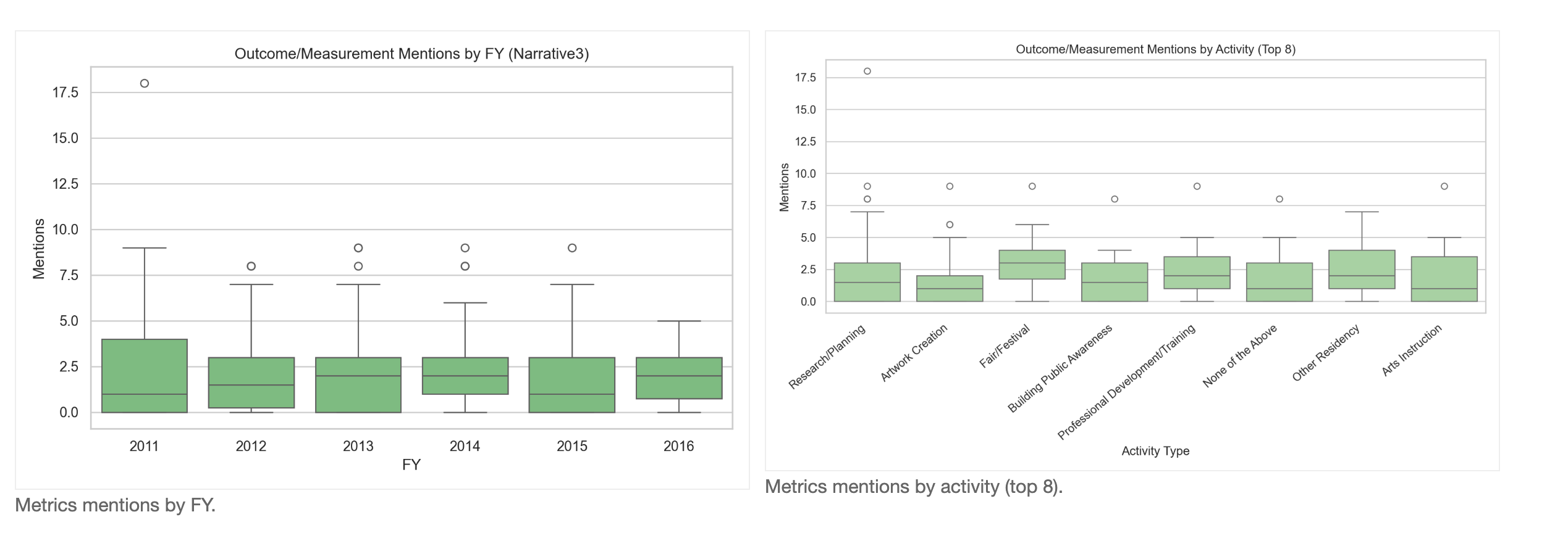
Answer
Measurement language is modest overall (mean 2.05), and 28.8% of projects contain zero measurement terms. Among the top‑volume activities, the highest averages are in Fair/Festival (2.94), Professional Development/Training (2.82), and Research/Planning (2.50). The lowest among the top 8 is Artwork Creation (1.68). FY means peak in FY2011 (2.37) and are lowest in FY2015 (1.79).
Time Shifts
Question
How does placemaking discourse evolve over time?
Method
We count thematic lexicons and normalize by words (per 1,000 words) by FY.
Evidence
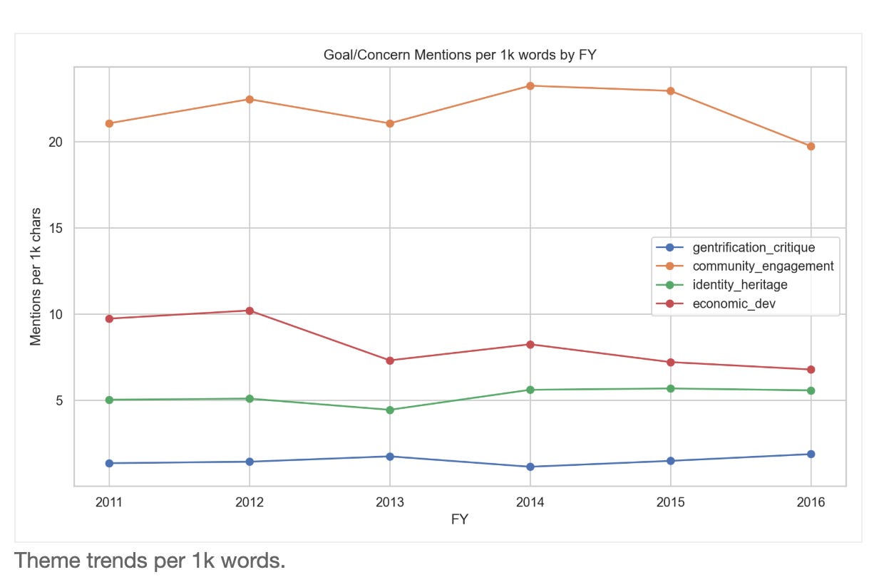
Answer
Per‑1k trends show diverging themes. Community engagement is consistently highest, peaking in FY2014 (23.25) and declining by FY2016 (19.74). Economic development language declines from FY2011 (9.74) to FY2016 (6.79), after a peak in FY2012 (10.21). Identity/heritage rises modestly (FY2011 5.03 → FY2016 5.58), peaking in FY2015. Gentrification/equity remains lower overall but increases to its peak in FY2016 (1.88). Overall, the discourse shifts away from economic framing and toward identity/equity, while engagement stays central.
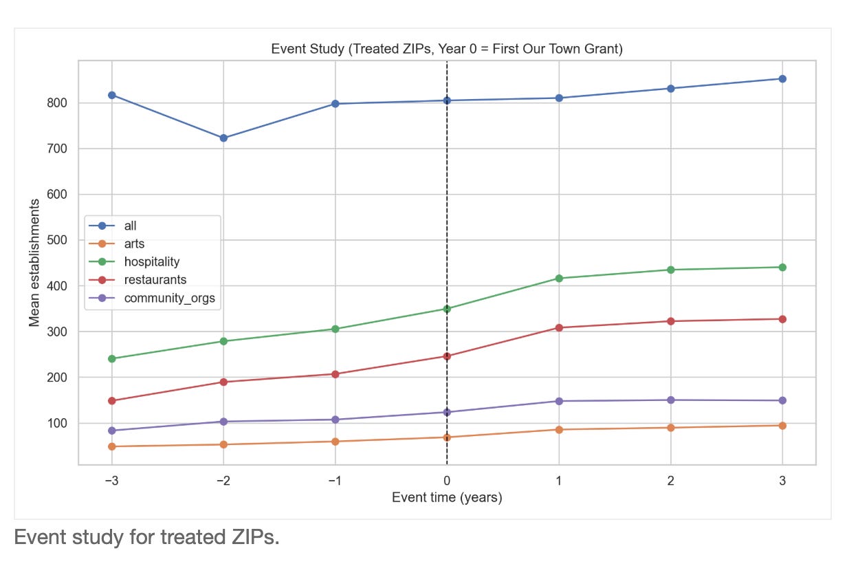
Zip Code Business Patterns Trends
Question
How do treated ZIPs compare to all ZIPs over time?
Method
We compute mean establishments per ZIP and treated shares using ZBP detail files and venue ZIPs.
Evidence
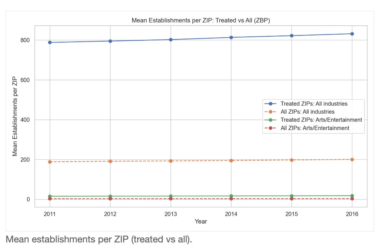
Answer
Treated ZIPs are consistently larger economic centers. For all industries, mean establishments per ZIP are 788.01 vs 188.41 in FY2011 and 831.73 vs 200.35 in FY2016 (roughly 4.1× higher in treated ZIPs). Treated ZIP counts are stable (726–727), and treated‑ZIP establishment share is flat (7.775%–7.808%). In arts (NAICS 71), treated ZIPs average 15.61–18.24 establishments vs 3.16–3.54 overall (about 5× higher). This indicates parallel trends with higher baseline levels in treated ZIPs rather than a sharp divergence.
ZBP Naive DiD
Question
Is there a before/after signal in treated ZIPs?
Method
We compute a cohort‑aligned pre/post DiD (−3 to −1 vs +1 to +3 years around first award year) with bootstrap CIs for treated vs untreated ZIPs, using ZBP files from 1998–2016. Sectors include all industries, arts (71), hospitality (72), restaurants (722), and community organizations (813).
Evidence
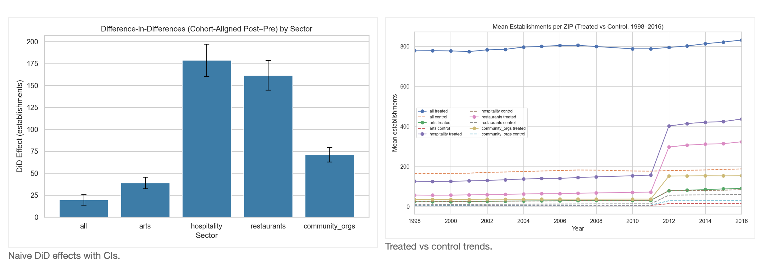
Answer
The cohort‑aligned DiD shows positive pre/post differences for all establishments (19.76; CI 13.51–25.09), arts (39.12; CI 32.91–44.50), hospitality (178.83; CI 162.54–193.02), restaurants (161.71; CI 146.30–175.92), and community orgs (71.17; CI 63.04–78.02). These estimates are descriptive (treated vs all, no matching) and should be interpreted directionally, not causally.
Caveat on the 2011→2012 visual jump. The large step-up in sector lines appears in both treated and control ZIPs at nearly identical rates, which is based change in how some of the NAICS codes were defined: arts 154.89% (treated) vs 154.85% (control), hospitality 156.15% vs 156.65%, restaurants 310.19% vs 310.97%, community orgs 305.93% vs 306.36%. All-industry levels move much less over the same interval.
Cohort Event Study
Question
How do effects vary by cohort timing?
Method
We align treated ZIPs by first award year and plot event‑time trajectories (±5 years) for treated cohorts and matched controls (matched on long pre‑trends plus NHGIS covariates).
Evidence
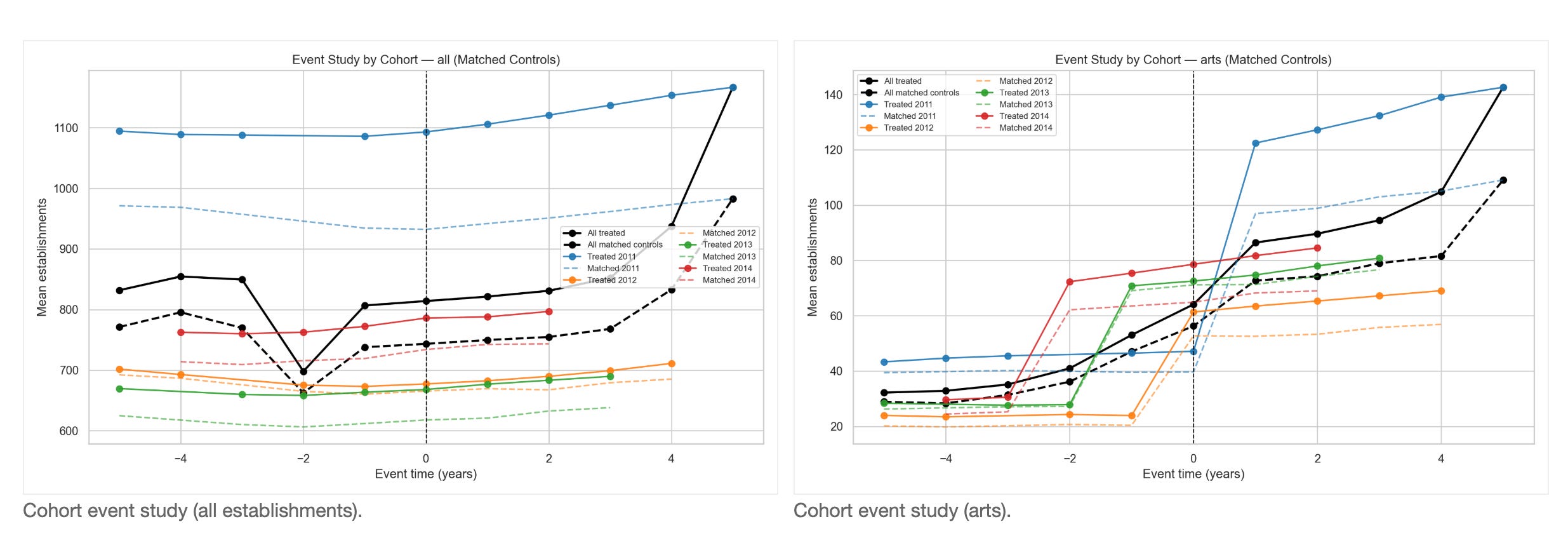
Answer
Treated cohorts rise after the award year, and matched controls rise more modestly. For the 2011 cohort, treated ZIPs show post‑minus‑pre increases of 47.52 (all) vs 4.26 in matched controls; hospitality 393.98 vs 302.04; restaurants 353.06 vs 272.04. Later cohorts are smaller (e.g., 2014: treated 27.97 all vs 28.38 matched; hospitality 141.59 vs 121.95; restaurants 126.49 vs 109.82). These trajectories are descriptive and should be read alongside matched DiD results.
Cohort Matched DiD
Question
Do cohort-specific effects appear after matching on long pre‑trends?
Method
We match on 1998–2010 pre‑period trajectories (log‑means and slopes) for all sectors plus NHGIS covariates (median household income and race/ethnicity shares from 2000 and 2008–2012), then estimate cohort‑specific DiD with bootstrap CIs. We also compute a pooled relative pre/post DiD across all cohorts using each ZIP’s first award year as the timing anchor.
Evidence
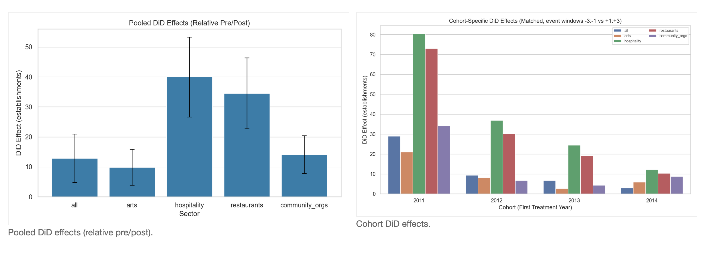
Pooled relative pre/post (all cohorts combined). All establishments: 12.89 (CI 5.12–20.90); arts: 9.89 (CI 4.68–16.42); hospitality: 40.00 (CI 26.24–52.61); restaurants: 34.57 (CI 23.74–46.77); community organizations: 14.10 (CI 7.93–19.96).
Cohort‑specific matched DiD results are heterogeneous. For all establishments, effects are significant in 2011 and not significant in 2012, 2013, 2014 (2011: 28.98 (CI 10.14–46.13); 2012: 9.41 (CI -4.91–25.93); 2013: 6.77 (CI -3.21–16.96)). For arts, effects are significant in 2011, 2012, 2014 and not significant in 2013 (2011: 20.94 (CI 3.47–39.03); 2012: 8.24 (CI 3.82–13.58); 2013: 2.77 (CI -3.78–10.52)). For hospitality, effects are significant in 2011, 2012, 2013 and not significant in 2014 (2011: 80.42 (CI 37.95–124.83); 2012: 36.91 (CI 15.58–60.84); 2014: 12.17 (CI -4.67–28.46)). For restaurants, effects are significant in 2011, 2012, 2013 and not significant in 2014 (2011: 73.04 (CI 41.85–109.34); 2012: 30.17 (CI 14.07–49.81); 2014: 10.30 (CI -1.84–23.64)). For community organizations, effects are significant in 2011, 2014 and not significant in 2012, 2013 (2011: 34.12 (CI 14.34–54.34); 2014: 8.80 (CI 2.80–14.76); 2012: 6.77 (CI -4.94–15.83); 2013: 4.39 (CI -2.27–10.72)). Overall, pooled effects remain positive, while cohort-level effects vary by sector and timing. Recall that business data only cover through 2016, so later years may not have had enough time to manifest effects.
Answer
Pooled relative pre/post (all cohorts combined). All establishments: 25.28 (CI 11.82–38.50); arts: 12.32 (CI 5.50–18.63); hospitality: 53.34 (CI 39.21–67.88); restaurants: 43.94 (CI 33.05–54.30); community organizations: 16.24 (CI 10.06–22.10).
Cohort‑specific matched DiD results are heterogeneous. For all establishments, 2011, 2013 are significantly positive (2011: 39.09 (CI 14.52–70.46); 2013: 12.72 (CI 0.46–24.54)), while 2012, 2014 are not significant (2012: 0.82 (CI -14.23–14.56); 2014: -5.50 (CI -25.74–14.39)). Arts effects are significant in 2011, 2012, 2014 but not in 2013 (e.g., 2011: 22.67 (CI 7.14–36.76); 2014: 7.41 (CI 1.41–14.42); 2013: 2.55 (CI -3.61–7.52)). Hospitality and restaurants are positive and significant in every cohort (e.g., hospitality 2011: 82.63 (CI 53.13–112.92); hospitality 2014: 53.13 (CI 29.30–75.92); restaurants 2011: 69.37 (CI 44.53–95.03); restaurants 2014: 42.43 (CI 26.69–59.23)). Community organizations are significant in 2011, 2014 but not in 2012, 2013 (2011: 28.85 (CI 16.48–40.37); 2014: 20.13 (CI 10.52–30.08); 2012: 4.83 (CI -1.62–11.10)). Overall, cohort effects remain strongest and most consistent in hospitality and restaurants, with more variability in all‑sector, arts, and community‑organization outcomes.
Extended Causal Enhancements
Question
Do the main findings hold under stronger staggered-adoption estimators, stricter matching diagnostics, robustness checks, falsification tests, and treatment-intensity models?
Method
Using the same ZIP-by-year panel, we estimate ATT(g,t) event studies for staggered treatment timing; apply constrained matching (state/urbanicity tiers, caliper, replacement) with standardized mean-difference diagnostics; run robustness specifications (excluding 2011→2012, log outcomes, and sector shares); run placebo/pseudo-treatment/negative-control falsification tests; and estimate dose-response models from FOIA venue/grant intensity.
Robustness runs the same question several ways (dropping the 2011→2012 break years, using logs, and using shares) to see if results depend on one modeling choice. Falsification uses fake treatments and unrelated sectors to test whether we would see the same pattern by accident. Dose-response checks whether ZIPs with more grant exposure also show larger changes.
How the dose-response test works: instead of only asking whether a ZIP was treated or not, this test asks whether ZIPs with more grant exposure also show more post-grant change. We build two exposure measures from the FOIA geography files: the number of venue-location records and the number of unique grants linked to each ZIP. Then, within matched pairs and years, we estimate how much outcomes move with an additional unit of exposure in the post period. In practical terms, the positive estimates here (all: 39.61, hospitality: 56.21, restaurants: 43.13) mean higher-exposure ZIPs tend to gain more establishments after grants than lower-exposure ZIPs.
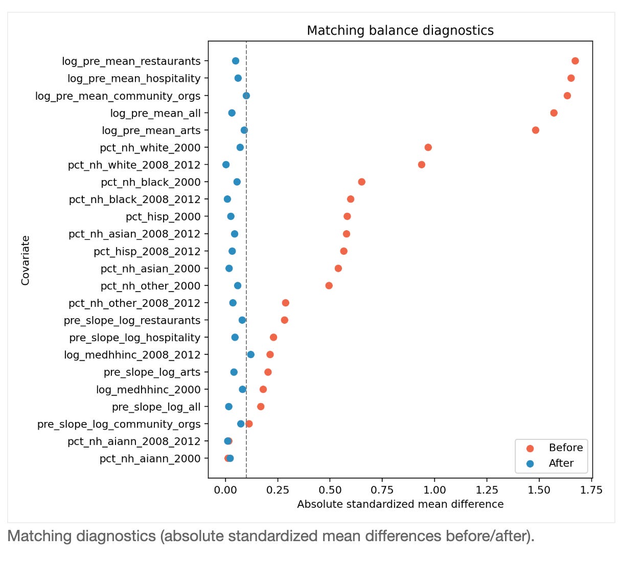
Answer
The stronger checks still point to a real grant-related impact, especially in hospitality and restaurants. The exact size varies by method, but the direction is mostly the same: places tied to grants tend to grow more after grants than similar places without grants.Matching quality improves sharply in the love-plot: mean imbalance drops from about 0.65 to 0.05, with 23 of 24 covariates below the common 0.10 threshold. In the baseline post-treatment window, estimated lifts are about 3.82 establishments for all sectors combined, 41.18 for hospitality, and 37.12 for restaurants.
Dropping the 2011→2012 transition changes the size (all-sector becomes 13.16), but does not flip the overall direction in key sectors. In fake-treatment checks, results this large are rare (all-sector pseudo-treatment empirical p=0.000), which supports a non-random signal. The negative-control manufacturing sector is much smaller (1.59) than main target sectors, which is directionally consistent with a place-based arts/community mechanism. Dose-response also lines up: ZIPs with more unique grant exposure show larger effects (all 39.61, hospitality 56.21, restaurants 43.13).
Spillover Effects (Nearby and City-Wide)
Question
Do grants in one ZIP appear to spill over into business outcomes in nearby ZIPs and at the city/metro scale?
Method
We map ZCTAs using the geocorr crosswalk and define spillover exposure as the treated share of other ZIPs in the same county (nearby) and in the same CBSA (city-wide). We estimate ZIP and year fixed-effects models by sector, reporting both full-sample models (direct + spillover terms) and controls-only models (spillover-only).
Evidence
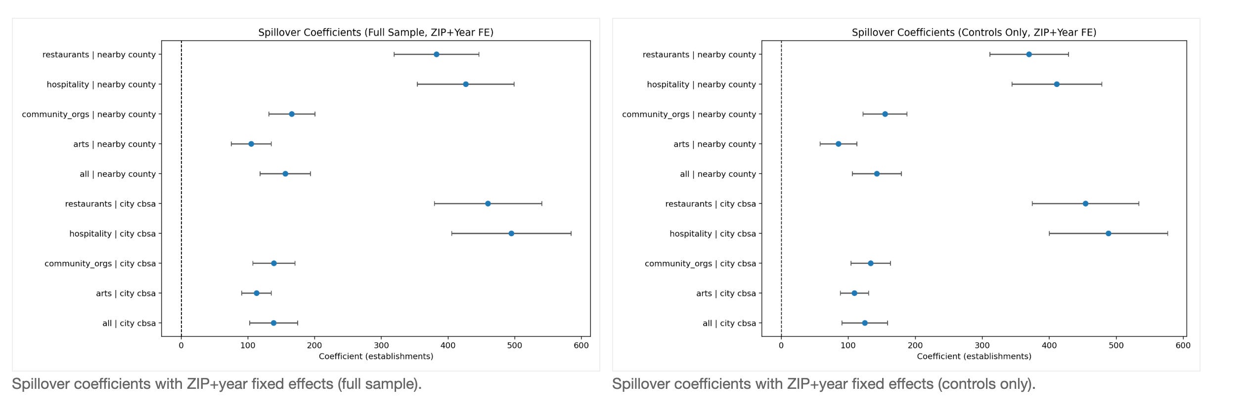
Answer
We see evidence that benefits are not only local to the funded ZIP. Nearby and city-level untreated ZIPs also tend to improve when more ZIPs around them receive grants. If spillover exposure rises from 10% to 20%, the model implies roughly 14.24 additional establishments in the nearby-county estimate and 12.44 in the city/CBSA estimate for ZIPs that were not directly funded.
The strongest spillovers appear in hospitality and restaurants: per 10-point exposure increase, hospitality is about 41.12 (nearby) and 48.82 (city-wide), while restaurants are about 36.97 and 45.41. In both spillover coefficient plots, most points are to the right of zero and their intervals are mostly above zero, which is why we read this as likely positive diffusion. Still, this remains observational evidence, so we treat it as strong suggestive evidence, not absolute proof of a guaranteed multiplier everywhere.
I would think about comparing arts district subsidies to subsidies for a new stadium and try to show that they were not just directing the economic activity to that particular zip code but what kinds of businesses entered the city or metro area