
Theory Visualization in the Social Sciences
Check out our special issue on the topic!

This post moves through Bob Dylan, sabbaticals, and sociological aesthetics, before arriving at a new special issue I recently co-edited on Theory Visualization in the Social Sciences (in The American Sociologist). Our introduction to the special issue makes the case that diagrams are not just illustrations but part of how sociologists think, shaping explanation and providing some common ground in a fragmented field. You can read the intro here.
One of my first Substack posts was about Bob Dylan’s autobiography. What struck me about Dylan’s book is how much it studiously avoids his golden years of peak creativity. Instead, it is mostly about the time afterwards, where ideas did not come on their own and he had to find ways to engineer creativity. He’d put himself purposefully in different situations, mix up chord patterns to see what happened, try out a new religion or two. While few of us are on Bob Dylan’s level, many of us still face a similar problem of finding ways to stay out of intellectual ruts.
This is at least in theory what the institution of the sabbatical is for in academia, and, again in theory, it interacts with other core institutions of the academic career, notably tenure. Getting tenure is of course a massive achievement, but for me at least, and I don’t think I’m alone, it also created a lot of anxiety, of the “burden-of-freedom” variety (nb: I am not complaining). Once you have tenure, there is really nothing holding you back from doing whatever type of intellectual work you want. That’s exciting, but it also is terrifying, since it means that if you do not produce anything of worth (and by that I do not mean “a high quantity of peer-reviewed journal articles in highly prestigious journals,” i.e. what it takes to get tenure), the answer as to why is looking at you in the mirror.
In my sabbatical year after I got tenure (back in 2017 or so), I tried to take a lesson from Bob. Every week I’d spend one day in a different neighborhood in Toronto, walking around, sitting and reading in cafes, striking up random conversations, taking pictures. I devoted part of another day to attending a talk or lecture at a GTA university, always in fields other than my own: economics, literature, biology, political science, philosophy, religious studies, geography, engineering, medieval studies, Germanic studies, statistics, whatever. And another part of the week to learning a new language, R.
But most importantly, I read a lot, with no instrumental plan in view about how it was supposed to “advance my research agenda” and issue in a new article anytime soon, or at all. I’d just follow threads wherever they took me.
One of those threads, and I don’t remember exactly how, led me into art criticism. I read a lot, but what really grabbed me was Michael Fried’s criticism and the idea of theatricality and absorption. Thinking about theatricality and absorption pushed me to wonder whether sociology itself wrestles with similar representational challenges. I never published about that, but I built up a big repository of ideas and examples, which I think will turn into a piece for a collection on social aesthetics somewhat soon (10 years later!).
This problem of representation in art made me wonder about the aesthetics of social life itself, which led me to a different but related thread, about sociological analyses as part and parcel of social aesthetics. I came to view sociology as an aesthetic effort to attain increasingly deepened perceptions of social life. I read a lot of John Dewey and Susanne Langer around that time and did eventually pull some of that together, using the classic Chicago School maps as a case study.
Then from there I found my way to Charles Sanders Peirce’s semiotics of diagrams, and the weird and wonderful literature around it. I spent some great weeks reading that stuff. That’s where I started to think of sociological visualizations, inspired too by the fact that Richard Swedberg had published a very cool article on the topic. So building on that, I tried to work out how sociological diagrams did and could more fully encode the full suite of Peircian reasoning, across abduction, induction, and deduction. On the way I went down more than a few Peircian rabbit holes, and am not sure if I ever got out.
From there, I was fortunate to team up with Gordon Brett. Gordon was then a PhD student, now a professor at Hong Kong University. We built a historical database of theory figures from a number of sociological journals, and studied how they worked, and how they didn’t. On the way we discovered that Stefan Bargheer had written a fantastic paper on the role of 2x2 tables in the history of sociological thought.
So we joined forces to edit a special issue in The American Sociologist on Theory Visualization in the Social Sciences. Our introduction just appeared, and you can see it here. Here’s a quick summary of what we say there, courtesy of GPT-5:
This special issue argues that diagrams are not just illustrations but part of how sociologists think. The introduction points out that while sociology may lack a unified substantive core, it has long relied on a small set of recurring visual forms — tables, arrows, planes — that cut across theoretical divides and quietly shape what counts as explanation. These forms don’t just display ideas, they help constitute them.
The essays explore this theme in different ways: how Bourdieu’s use of correspondence analysis reshaped his theory of fields; how the Likert scale became both a measurement tool and a theory of attitudes; how causal arrows lend rhetorical force to claims; how new formats can depict ambiguity or embed relations; and how visual practices guide pedagogy and public reasoning, from classroom diagrams to Covid dashboards. Together they show that sociology’s visual grammar is both a hidden infrastructure and a site for innovation.
I think all the articles in the special issue are terrific, and would urge you to check them out. I want to give a little air time here to the one by Julien Boelaert and Étienne Ollion, since Bourdieu seems to be of interest on Substack.
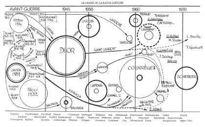
Boelaert and Ollion show how Bourdieu’s notion of social fields evolved alongside his changing visual practices. In his early work, he often drew diagrams by hand, using them to capture movement over time and fine-grained distinctions between individuals in similar positions. These sketches allowed him to emphasize the dynamism of fields, their histories, and the local subtleties of social life. After 1975, however, when he and his collaborators began systematically using geometric data analysis, the visual form of the field shifted.
Computer-generated correspondence analyses produced planar maps that highlighted overall structure but had difficulty representing time or small local differences. Even when Bourdieu continued to redraw figures by hand, they increasingly mimicked the style of these computer outputs. His most famous diagram (below) was actually hand drawn, but it is unmistakably influenced by the kinds of statistical outputs his mind had become trained on.
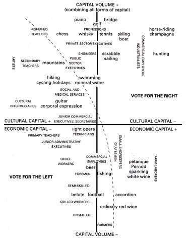
The contrast to his earlier diagrams is striking (the image at the top of this post is an example). The result was that the concept of field itself became more spatialized and synchronic. Society appeared less as a set of trajectories and fine distinctions, and more as a global arrangement of positions on a two-dimensional plane.
Boelaert and Ollion argue that this change reflects a broader phenomenon: methods of visualization do not simply illustrate theory, they transform it. In Bourdieu’s case, the move from sketches to data-driven graphics consolidated the spatial metaphor at the heart of field theory, while narrowing the range of properties that could be foregrounded. The story is thus one of how visualization technologies, as much as conceptual innovations, shape the ways sociologists come to perceive the social world.
It is a wonderful illustration of the role of sociological aesthetics in social aesthetics. But there is a lot of other great stuff in the issue, check it out!
Introduction
Theory Visualization in the Social Sciences
Stefan Bargheer, Gordon Brett, Daniel Silver
Articles
Representing the Social Space: How Geometric Data Analysis Shaped Bourdieu’s Theory of Fields
Étienne Ollion & Julien Boelaert
– On how Bourdieu’s concept of fields evolved alongside his visual practices, moving from hand-drawn diagrams to correspondence analysis maps.Visualizing the Black-Box: Likert Scales and the Creation of Theory-Method-Case Packages
Stefan Bargheer
– On the Likert scale as both a measurement device and a tacit theory of attitudes, showing how its visual form shaped decades of survey research.Theory Figures and Causal Claims in Sociology
Gordon Brett & Daniel Silver
– On how causal diagrams (especially arrows) reinforce or amplify causal claims, often going further than textual arguments alone.Theory-Laden Data Visualization, Drawing-As and Seeing-As in Sociology and in Data Science
Janet Vertesi
– On how visual formats such as regression tables, dashboards, and hashtag clouds are embedded with theoretical assumptions and institutional values.Visualizing Social Theory with Embedded Relational Diagrams: Theoretical Illustration, Development, and Innovation
Rima Wilkes & Aryan Karimi
– A new visualization strategy, combining categorical classification and causal arrows, highlighting both the strengths and omissions of standard typologies.Drawing Out Definitions
Dustin Stoltz & Michael Wood
– On visual strategies for representing ambiguity, introducing tools such as property spaces, schematic networks, and dynamic trees to depict fuzzy concepts.